-
Group M HR Data Analyst
Group M HR Data Analyst position I saw Group M posted this job advertisement on 7 Aug 2021 and decided to help you identify the skills you require for the job. The link to the job advertisement can be found here https://www.linkedin.com/jobs/search/?currentJobId=2669934758&pivotType=jymbii And these are my opinion on what you need to have to excel in the job. Reporting to the Head of HR The HR Analyst is reporting to the Head of HR. This means that the person must have some knowledge of HR matters. This is what we call domain knowledge. Experience with tools and languages such as Tableau, Microsoft Power BI, SQL, R, Python The HR job…
-
New year 2021 resolution starts now
#business #sales #marketing
-
Easy to create
-
Checkpoints are important
-
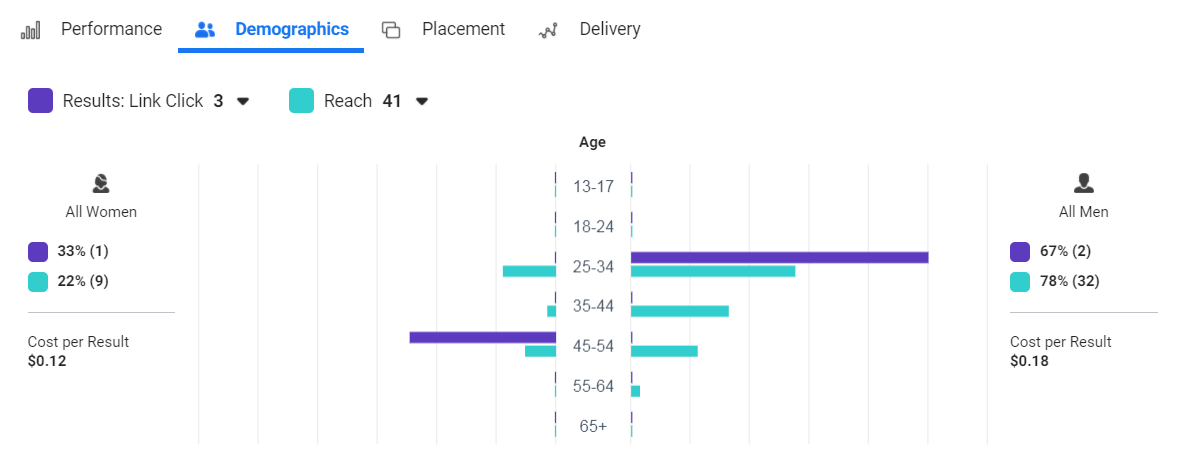
What is a good visual
This visual is good to look at. But it is not practical. In fact, it is disruptive to analysis because the flow of information “jumped”. A good visual should be easy and quick to understand, within a few seconds of looking at it. The visual should flow with the analysis. In this visual, even though the presentation is to show the distribution of the views among the different age groups, the 2 bar charts (represented by 2 different colours) are drawn with different scales. By presenting them together, it gives the impression that the purple bar is more than the green bar. But in actual fact, it is less than…
-
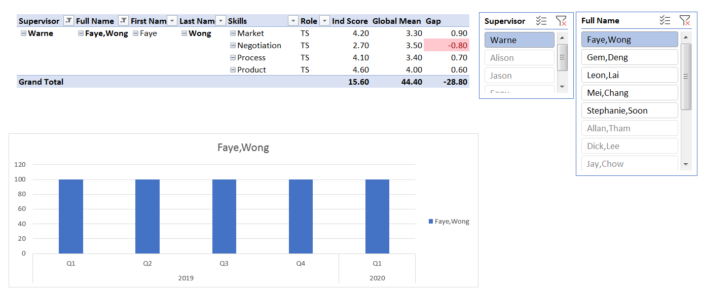
Pivot Table with Percentage of Sales
I was reviewing the video recording of our course “Grow Your Profit Through Data Analytics and Data Modelling” and this feature was highlighted. Do you know that you can present the Monthly Sales and % of Sales side by side as you see in the picture? Not many people know of this function. If you know, that’s good. If you don’t, you can learn about it in our course “Grow Your Profit Through Data Analytics and Data Modelling“.
-
The Primary Purpose of Data Visualization
-
One Step to Data Analytics from Excel
Do you see the white dotted lines on the road? Just like this road that is separated by the dotted line, Excel and Data Analytics are also separated by a thin dotted line. If you have been extracting data, filtering data, copying and pasting data in Excel, you can easily step across to the other side of the road and take the data analytics path. Both share the same skills and both can be achieved using Excel. Check out both courses below. Hidden Secrets of Data Analysis in Excel Grow Your Profits Through Data Analytics and Data Modelling
-
Arrow or Dart?
The target was at a distance, about 100m away. She held up the bow, place the arrow on the bow, pulled the arrow against the string and took aim. The arrow flew out of the bow and she let go and hit the target at the bullseye. The bow is like the control key on your keyboard. The arrow key is the arrow. If you just simply press the arrow key, you can only move to the next cell. But by pressing and holding on to the control key first and then press the arrow key at the same time, you can fly to the last row of your data.…
-
Green bar in Power Query
Did you see the green bar in the picture? It is just below the header. These 2 columns have different green bars. One is a complete green bar while the other is shared with a grey bar. The green bar is an indication that the list in that column. If the green bar is full, it means that all the values are displayed. But if the green bar is shared with a grey bar, this means that some of the values are filtered. Actually, there is another colour. It’s red. When it appears, it means that the column contains error values.