-
New year 2021 resolution starts now
#business #sales #marketing
-
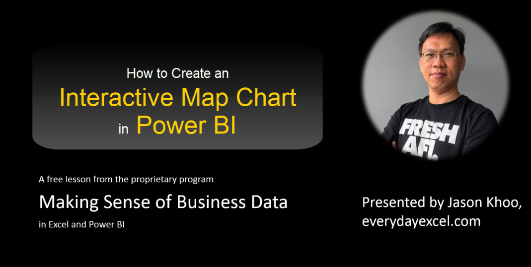
Easy to create
-
Checkpoints are important
-
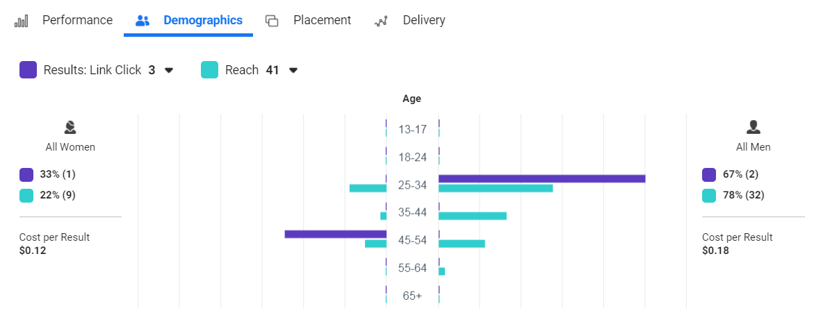
What is a good visual
This visual is good to look at. But it is not practical. In fact, it is disruptive to analysis because the flow of information “jumped”. A good visual should be easy and quick to understand, within a few seconds of looking at it. The visual should flow with the analysis. In this visual, even though the presentation is to show the distribution of the views among the different age groups, the 2 bar charts (represented by 2 different colours) are drawn with different scales. By presenting them together, it gives the impression that the purple bar is more than the green bar. But in actual fact, it is less than…
-
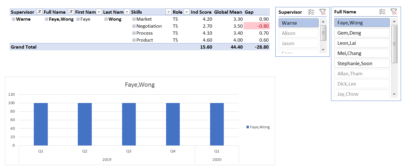
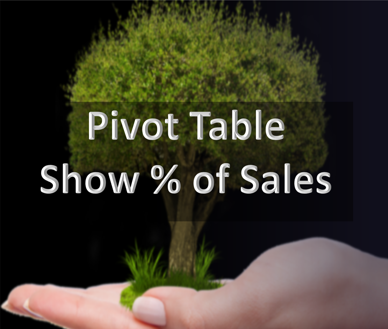
Pivot Table with Percentage of Sales
I was reviewing the video recording of our course “Grow Your Profit Through Data Analytics and Data Modelling” and this feature was highlighted. Do you know that you can present the Monthly Sales and % of Sales side by side as you see in the picture? Not many people know of this function. If you know, that’s good. If you don’t, you can learn about it in our course “Grow Your Profit Through Data Analytics and Data Modelling“.