It is not the looks that count
It is not the looks that count

Making a good first impression in your presentation/report is important because it will capture your audience attention right from the start and make them want to hear you out.
But that is only the first step.
What follows next will determine if you can leave a lasting impression on your audience.
Most people have the impression that good looking visuals are all that matters and miss the whole purpose of data visualization.
A good data visualization report is not only good looking, but it also makes the numbers you want to share more easily understood and allows your audience to take action.
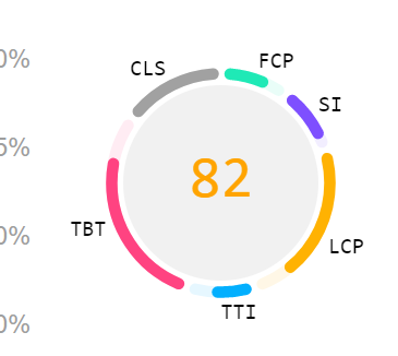
In this google pagespeed report, the visualization (circle on the right) gives an anchor or main score of 82. Surrounding the number are the components that make up the score of 82. It shows 100 as the full score (faded colour) and the actual scores in solid colour. This help to identify the importance of each component and how well each component has performed.
There are 2 immediate application I can think of when I see this visualization. One is for trainers and teachers. The main score is the score of the assessment. And each component represents the topics being assessed on. By looking at the circle, the trainer or teacher will be able to identify which area the student/class is weak in. This can immediate identify the topic that requires more attention.
Another application is in budgeting and forecasting. The main score shows how far away the company is in meeting the targets. By presenting the targets as a total score of 100, we can see the importance of the targets and how far away is each department in meeting the agreed targets.
I am sure there are other applications for this visual. Can you think of any?
If you would like to know more about our data visualization courses, complete the form below.