analytics
Excel and Power BI Mastery: Leveraging the Data Value Chain for Analytics and Reporting
Are you looking to improve your data analytics and reporting skills using Excel and Power BI? These popular software tools are powerful resources for data management, modeling, visualization, and transformation. However, simply learning the software’s basic functions may not be enough to fully realize their potential. To maximize your use of Excel and Power BI, you need a solid understanding of the underlying data value chain framework.
In our training, we’ll explain what the data value chain is and how it relates to Excel and Power BI. We’ll also outline the benefits of using this framework for learning and give you some practical tips on how to get started. Through our courses, we can help you master the data value chain and achieve your data analytics goals.
The Data Value Chain: A Framework for Learning Data Analytics
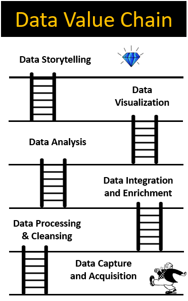
The data value chain is a conceptual framework that helps us understand how data is collected, processed, and transformed into insights. It consists of several stages, including data acquisition, data preparation, data modeling, data visualization, and data dissemination. Each stage involves different tools, techniques, and skills.
By understanding the data value chain, you can see how Excel and Power BI fit into the broader context of data analytics. Excel is often used for data preparation, modeling, and analysis, while Power BI is typically used for data visualization and dissemination. However, both tools can be used for various stages of the data value chain.
The Benefits of Using the Data Value Chain
Using the data value chain framework has several benefits when learning Excel and Power BI. First, it helps you to see the big picture of data analytics, rather than just focusing on the software. You’ll gain a deeper understanding of how different stages of the value chain are interconnected and how each stage contributes to the final insights.
The data value chain can also help you to identify your strengths and weaknesses in data analytics. You can see which stages you’re comfortable with and which you need to work on. This can guide you in choosing the right courses, resources, and projects to improve your skills.
Finally, using the data value chain can help you to communicate your work more effectively. You’ll be able to explain to others how you collected, prepared, modeled, visualized, and disseminated the data, and how each stage contributes to the insights. This can help you to collaborate better with others and to make more informed decisions based on data.
Practical Tips for Learning through the Data Value Chain
Here are some practical tips for using the data value chain framework to learn Excel and Power BI:
Step 1: Start with the basics

Learn the basic functions and features of Excel and Power BI, such as data entry, formatting, calculations, charts, and tables. This will give you a solid foundation for the rest of the value chain.
Step 2: Identify your goals

Think about what you want to achieve with Excel and Power BI. Do you want to analyze sales data, track expenses, or create dashboards? This will help you to focus on the relevant stages of the value chain.
Step 3: Choose the right resources

There are many resources available for learning Excel and Power BI, such as online courses, tutorials, books, and forums. Choose the ones that are relevant to your goals and learning style.
If you’re looking for high-quality courses that teach data analytics through the data value chain framework, everydayExcel offers a wide range of courses to help you master these skills. Our courses cover all stages of the data value chain, from data acquisition to data dissemination. We focus on practical applications and real-world examples, so you can learn by doing.
For example, our Hidden Secrets of Data Analysis in Excel course covers data acquisition, data preparation, data modeling, and data visualization. You’ll learn to use Excel to clean and transform data, create pivot tables and charts, and build interactive dashboards. Our Data Visualization with Power BI course focuses on data visualization and dissemination, training you on how to create compelling reports and dashboards using Power BI’s advanced features.
In addition to our courses, we also offer personalized coaching and consulting services. Our experienced instructors can work with you one-on-one or in a group setting to help you achieve your data analytics goals. We can also provide custom training solutions for organizations that need to upskill their teams.