Sleep Chart
Sleep(y) Chart

Is this a good chart to you?
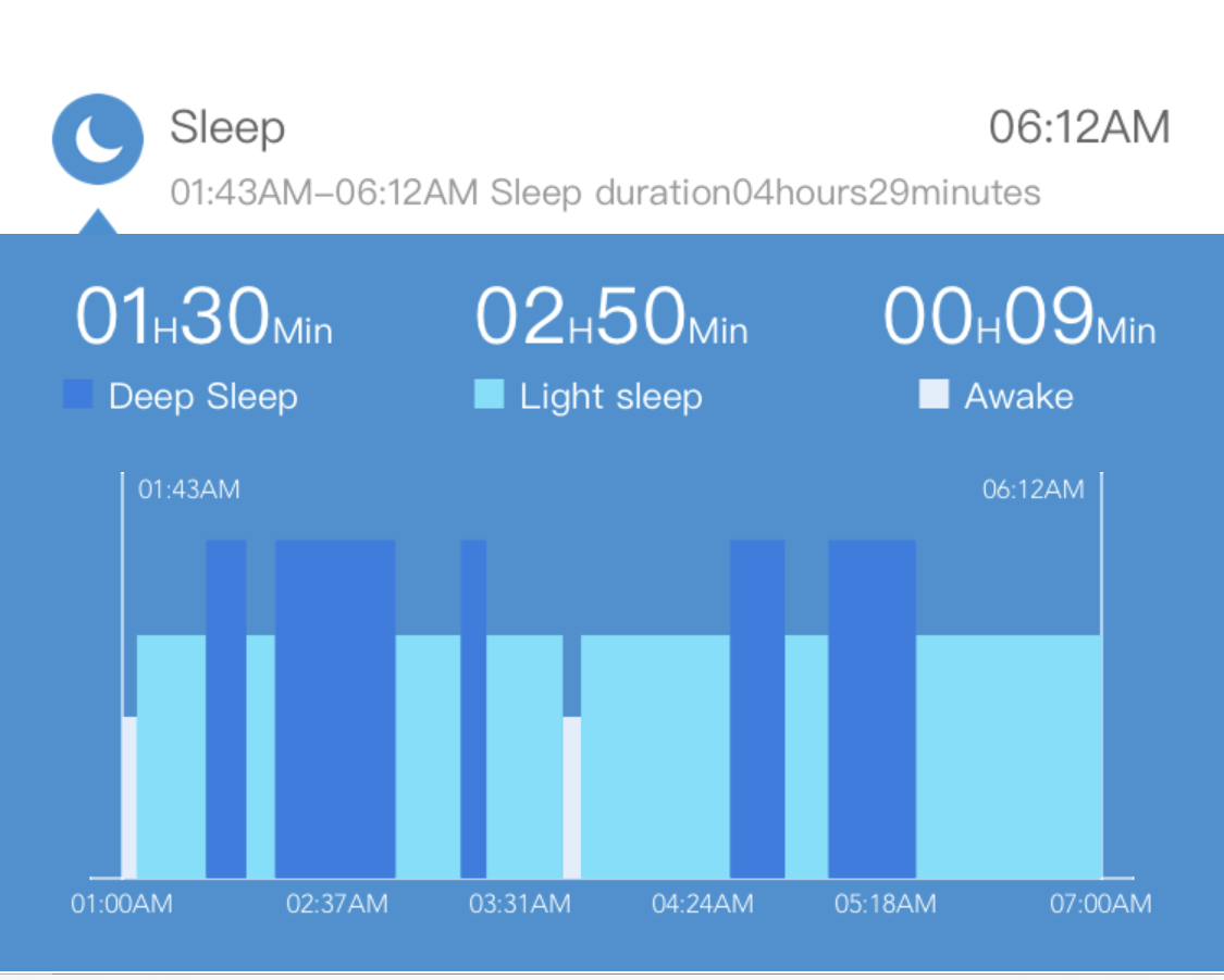
I managed to find this chart which showed the sleeping pattern of a person for one day.
Although it is just a single chart, it has gotten all the necessary details in. There are of course some “flaws” which create a little confusion. But overall, it is a good chart/report to present.
If you wish to find out what I think of the chart, read on.
The chart started off with the start and sleep time of the person. But the words are too small to be seen.
But what caught my attention are the 3 values that follow, Deep sleep, light sleep and awake time.
Maybe it is done on purpose because the chart wanted to catch the readers’ attention on the 3 values. Start and end time of the sleep is really not interesting.
The chart caught my attention immediately with the 3 values which account for the total sleep time between the starting time and ending time of the sleep. A good summary before looking at the chart in detail.
In the chart, the 3 categories are represented by a single colour blue with different shades. Having more colours may not deliver the same message as compared to different shades.
Light blue colour represent light sleep. Deep sleep is represented by a darker shade to differentiate between the light sleep and deep sleep. The darker shade represents the higher intensity of the sleep and is well chosen. White colour represents awake time. It is like seeing light when you open your eyes.
We may think that deep sleep occurs in one single block. This chart broke that belief by showing that deep sleep occurs in multiple time frame/blocks.
The chart clearly shows the whole duration of sleep and when light/deep sleep occurs.
To make the chart interesting, the sleeping pattern is plotted from the time the person sleep until the person wakes up. If I am not wrong, it is shown on a per min basis.
However, I am not sure why the blocks are not of the same height. If it is one minute per line, then all the blocks should have the same height. If that minute has a mix of deep and light sleep, it should add up to the same height. But it did not. This is something that left me scratching my head without getting an answer. No a good ending for me in this case.
But overall, I believe this is a good chart and we should learn from this chart how we should present our data.
