data visualization
How to make your charts stand out
When using a line chart to compare sales between 2 periods
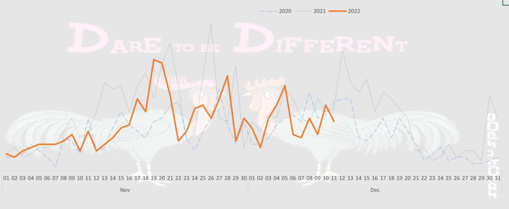
Make your chart stands out does not mean making fanciful charts to attract attention although it is a plus point if you can do it.
Making your chart stands out could also be referring to emphasizing the line chart that you want your audiences to draw their attention to.
In the example given, I want to draw my audience’s attention to the line chart in 2022. Hence, I colored the 2022 line orange. The 2020 and 2021 lines are purposedly colored light with a thin line so that they could be used as a comparison and yet not overshadow the main line.
When using a Pie chart to show percentage
Most people would have squeezed all the categories into one pie chart to show the percentage contribution by category. This is not ideal as it is not easy to read.
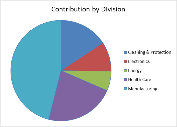
Instead of presenting a pie chart, present each category in one pie chart. It will offer better clarity and contribution by category.
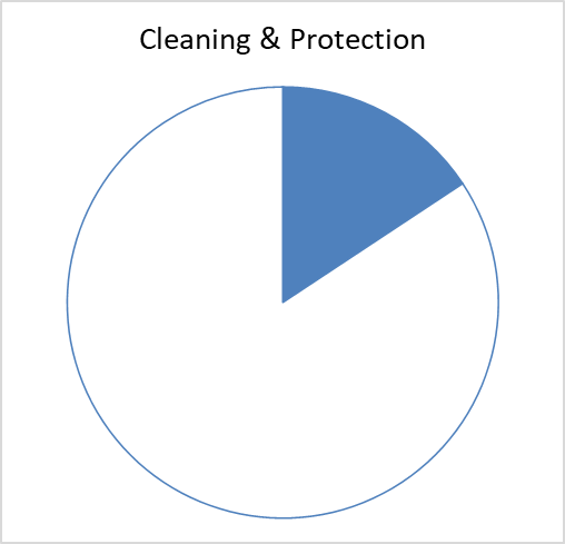
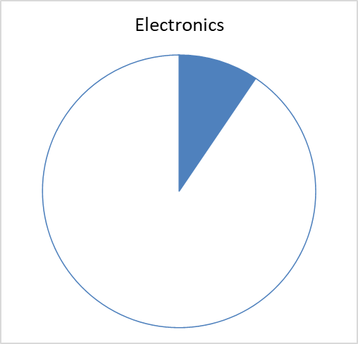
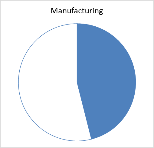
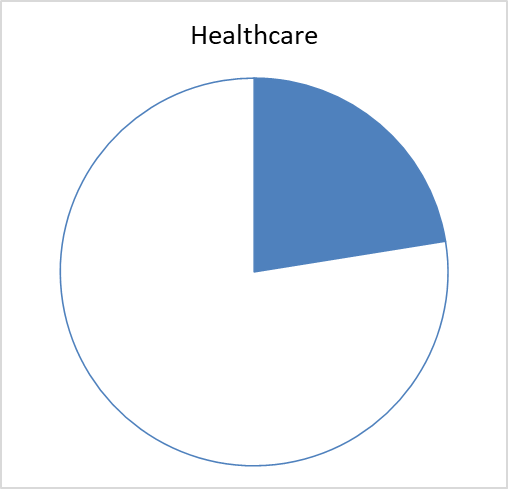
If you like, you can use a colour for each pie. This will make the categories more distinct.
Learn more about Data Visualization in our courses in Excel and Power BI.