3 Important Criteria for Data Presentation
3 Important Criteria for Data Presentation
The 3 criteria are:
- Easy to understand
- Easy to follow
- Easy to remember
1. Easy to understand
Presentation your data in an easy to understand manner helps your audience process the information faster and at the same speed for everyone. When your audience understand what you are presenting, they are likely to focus on your presentation and what you said.

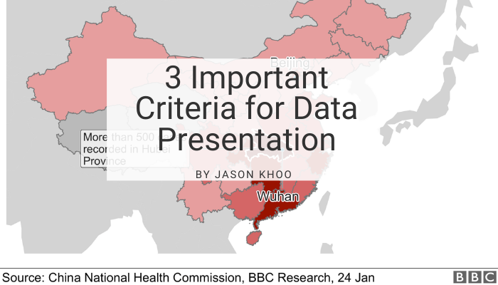
The heat map of COVID-19 was easy to understand. It used different shades of red to represent different number of infections, with darker shade representing more cases and lighter shade representing less. The additional of the map instead of just listing the provinces and the numbers in table form, helped the reader to process one less piece of information on their own: the location of these provinces.
I believe red colour was used because it represented danger. Notice that there was very few or no display of numbers on the map? Adding numbers on the map will clutter the map and the effects may not be as good as what we are seeing now. The different shades of red were more than enough to identify provinces where the infection was more serious than others.
There were 2 labels, one on Beijing, the capital of China and another on Wuhan, the origin of the infection. It gave only key reference points to help us understand how the virus has spread in China.
Why not table of numbers?
Listing just the numbers n table form may offer an accurate account on the number of people infected. Those who were familiar with the provinces of China will process the numbers effortlessly while others will have to struggle to associate the numbers with the location of the provinces. If they were not able to make the association, they will not be able to follow the presentation and you risk losing them to other easier-to-understand statistics.
2. Easy to Follow
In order to engage your audience effortlessly during your presentation, it is important to prepare your charts or presentation in an easy to follow format. When they can follow you, you have their full attention.

The diagram has placed the dates horizontally for easy reading. We can effortlessly trace when the cases happened and look out for any relationship between the cases. Dates was the anchor of reference in this case. Imagine arranging the dates vertically. The diagram would have widened out of the screen or become too small to read easily.
Timeline is commonly used in many places to show sequence of events. Presenting dates vertically works well for single dimension data and when there is a width constraint. But when there is additional dimension to present, it is more common to place the dates horizontally.
Another feature that was used and worth mentioning here was the use of the gender symbol. The presenter did not simply draw circles for the case numbers but use the gentle symbols for each case number. This helped to identify the gender of each infected person without using any words.
For improvement, the cases can be grouped into the original sources of infection for ease of reference.
3. Easy to remember
Making your information easy to remember is another important criteria. This is measured by the number of people who can recall your numbers and the number of people the information is shared with. Most people would not be able to remember the exact number. It is important therefore to make the number as easy to remember as possible.
For example, I would need more effort to remember a number like 137 unless it holds some meaning for me. The number 125 or 150 are usually easier to remember. Another way to remember a number closer to 137 would be making reference to a specific event known to your audience, such as the company anniversary. For example, if the company anniversary for this year is 70, it is easier to present the number to your colleagues as double the company anniversary. For wider groups of audience, we could use double the retirement age as reference. The number they remember is likely to be 65 or 70, at least for Singapore. So the number 130 or 140, which are close to 137 could be more easily remembered.
Making your data presentation meet these 3 criteria takes time and effort. Practicing it over time will make it easier for you to meet these 3 criteria, which is
1. Easy to understand
2. Easy to follow
3. Easy to remember.
If this article is useful, please like it or comment so that I know it is helpful to you. Share with your friends if you think it can help them.